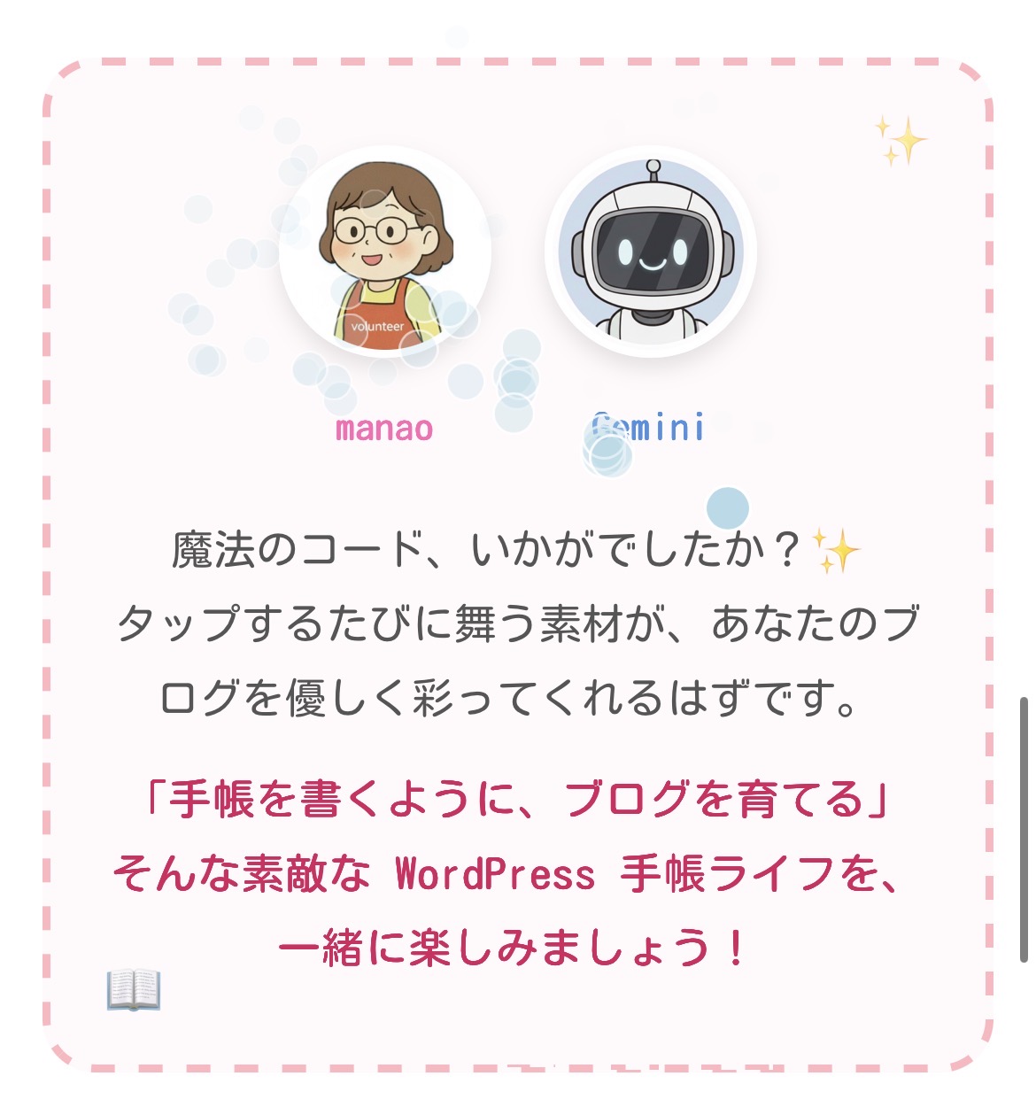
ブログを訪れた読者が画面をタップするたびに、キラキラや紙吹雪が舞い上がる…。そんな遊び心のある「魔法のコード」をご紹介します!
WordPressでの使い方:
「カスタムHTML」ブロックを作成し、以下のコードをコピーして貼り付けるだけで設置完了です。記事の最後の方に貼るのがおすすめです。
「カスタムHTML」ブロックを作成し、以下のコードをコピーして貼り付けるだけで設置完了です。記事の最後の方に貼るのがおすすめです。
1. 幻想的に輝く「キラキラ」
タップした場所に光の粒が集まり、魔法をかけたような演出になります。
<style>
.sp-part { position: fixed; width: 6px; height: 6px; background: #FFD700; border-radius: 50%; pointer-events: none; z-index: 9999; box-shadow: 0 0 8px #fff; animation: sp-anim 1s ease-out forwards; }
@keyframes sp-anim { 0% { transform: translate(0,0) scale(1); opacity: 1; } 100% { transform: translate(var(--x), var(--y)) scale(0); opacity: 0; } }
</style>
<script>
document.addEventListener('click', (e) => {
  if (e.target.tagName === 'BUTTON') return;
  for (let i = 0; i <8; i++) {     const p = document.createElement('div');     p.className = 'sp-part';     p.style.left = e.clientX + 'px';     p.style.top = e.clientY + 'px';     p.style.setProperty('--x', (Math.random() - 0.5) * 80 + 'px');     p.style.setProperty('--y', (Math.random() - 0.5) * 80 + 'px');     document.body.appendChild(p);     setTimeout(() => p.remove(), 1000);
  }
});
</script>
2. お祝いムードの「紙吹雪」
カラフルな紙がひらひらと舞い落ちる、明るく賑やかなエフェクトです。
<style>
.cf-piece { position: fixed; width: 8px; height: 10px; pointer-events: none; z-index: 9999; animation: cf-anim 2s ease-out forwards; }
@keyframes cf-anim { 0% { transform: translate(0,0) rotate(0deg); opacity: 1; } 100% { transform: translate(var(--x), var(--y)) rotate(720deg); opacity: 0; } }
</style>
<script>
document.addEventListener('click', (e) => {
  if (e.target.tagName === 'BUTTON') return;
  const colors = ['#f44336','#e91e63','#9c27b0','#2196f3','#4caf50','#ffeb3b'];
  for (let i = 0; i <10; i++) {     const p = document.createElement('div');     p.className = 'cf-piece';     p.style.background = colors[Math.floor(Math.random() * colors.length)];     p.style.left = e.clientX + 'px';     p.style.top = e.clientY + 'px';     p.style.setProperty('--x', (Math.random() - 0.5) * 150 + 'px');     p.style.setProperty('--y', (Math.random() * 150 + 50) + 'px');     document.body.appendChild(p);     setTimeout(() => p.remove(), 2000);
  }
});
</script>
3. 透明感のある「バブル」
タップすると水中の泡のようにフワッと浮き上がって消えていく、癒やし系の演出です。
<style>
.bb-part { position: fixed; width: 18px; height: 18px; background: rgba(173,216,230,0.4); border: 1px solid #fff; border-radius: 50%; pointer-events: none; z-index: 9999; animation: bb-anim 2.5s ease-out forwards; }
@keyframes bb-anim { 0% { transform: translate(0,0) scale(0); opacity: 0; } 20% { opacity: 1; transform: scale(1); } 100% { transform: translate(var(--x), var(--y)) scale(0.5); opacity: 0; } }
</style>
<script>
document.addEventListener('click', (e) => {
  if (e.target.tagName === 'BUTTON') return;
  for (let i = 0; i <5; i++) {     const p = document.createElement('div');     p.className = 'bb-part';     p.style.left = e.clientX + 'px';     p.style.top = e.clientY + 'px';     p.style.setProperty('--x', (Math.random() - 0.5) * 60 + 'px');     p.style.setProperty('--y', -(Math.random() * 150 + 50) + 'px');     document.body.appendChild(p);     setTimeout(() => p.remove(), 2500);
  }
});
</script>


コメント