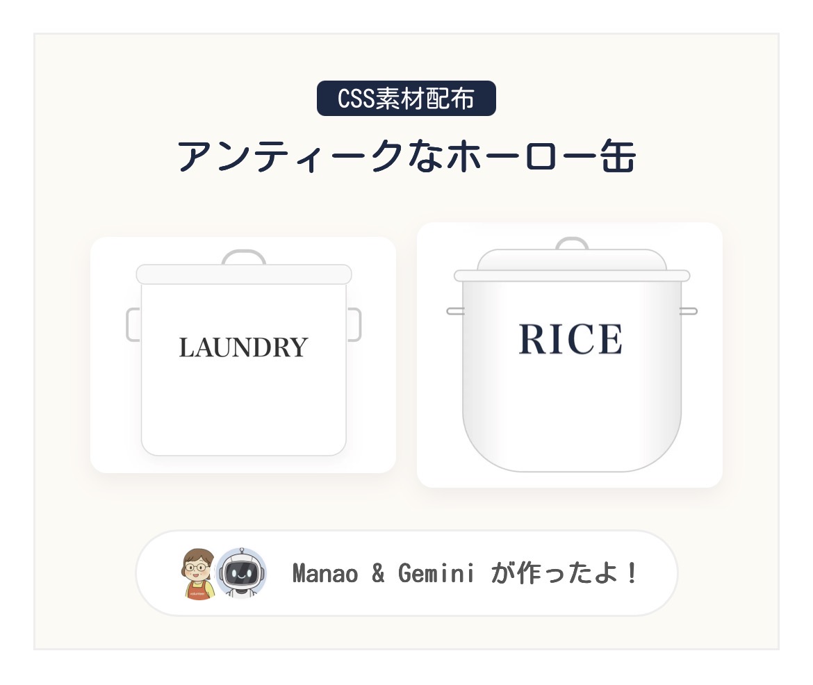
CSS素材配布
アンティークなホーロー缶
Manao
ホーロー缶の可愛さをブログでも表現したくて、Geminiに相談してCSS素材を作ってみたよ!
Gemini
はい!画像を使わずコードだけで、あの独特のツヤ感や「帽子のような蓋」の形を再現しました。読み込みも爆速ですよ!
ホーロー缶 CSS素材配布
以下のコードをコピーして、WordPressの「カスタムHTML」ブロックに貼り付けてください。文字や色は自由にカスタマイズ可能です。
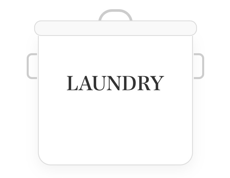
PREVIEW IMAGE
LAUNDRY缶(スクエア型)
<!-- LAUNDRY缶 -->
<div class="can-laundry">
<div class="l-h-top"></div>
<div class="l-lid"></div>
<div class="l-body">
<div class="l-side s-left"></div>
<div class="l-side s-right"></div>
<p class="l-txt">LAUNDRY</p>
</div>
</div>
<style>
.can-laundry { width: 180px; margin: 20px auto; position: relative; font-family: serif; text-align: center; }
.l-h-top { width: 40px; height: 16px; border: 3px solid #ccc; border-bottom: none; border-radius: 20px 20px 0 0; margin: 0 auto -3px; }
.l-lid { width: 105%; height: 18px; background: #f9f9f9; border: 1px solid #ddd; border-radius: 8px; margin-left: -2.5%; position: relative; z-index: 2; }
.l-body { width: 100%; height: 150px; background: #fff; border: 1px solid #ddd; border-top: none; border-radius: 0 0 15px 15px; display: flex; align-items: center; justify-content: center; position: relative; box-shadow: 0 5px 15px rgba(0,0,0,0.05); }
.l-side { width: 12px; height: 30px; border: 2.5px solid #ccc; position: absolute; top: 20px; }
.s-left { left: -14px; border-right: none; border-radius: 6px 0 0 6px; }
.s-right { right: -14px; border-left: none; border-radius: 0 6px 6px 0; }
.l-txt { font-size: 22px; font-weight: bold; color: #333; margin: 0; }
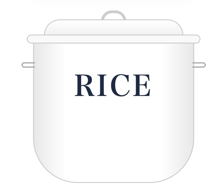
</style>PREVIEW IMAGE
RICE缶(帽子蓋・ワイド型)
<!-- RICE缶 -->
<div class="can-rice">
  <div class="r-h-top"></div>
  <div class="r-lid-top"></div>
  <div class="r-lid-brim"></div>
  <div class="r-body">
    <div class="r-side h-left"></div>
    <div class="r-side h-right"></div>
    <p class="r-txt">RICE</p>
  </div>
</div>

<style>
.can-rice { width: 180px; margin: 20px auto; position: relative; font-family: serif; text-align: center; }
.r-h-top { width: 28px; height: 12px; border: 3px solid #ccc; border-bottom: none; border-radius: 12px 12px 0 0; margin: 0 auto -2px; }
.r-lid-top { width: 156px; height: 18px; background: linear-gradient(#fff, #f0f0f0); border: 1px solid #ccc; border-bottom: none; border-radius: 40px 40px 0 0; margin: 0 auto; z-index: 2; position: relative; }
.r-lid-brim { width: 194px; height: 10px; background: #f9f9f9; border: 1px solid #ccc; border-radius: 8px; margin-left: -7px; margin-top: -1px; z-index: 3; position: relative; }
.r-body { width: 180px; height: 160px; background: linear-gradient(to right, #e8e8e8, #fff 20%, #fff 80%, #e8e8e8); border: 1px solid #ccc; border-top: none; border-radius: 0 0 50px 50px; margin-top: -4px; display: flex; align-items: center; justify-content: center; position: relative; }
.r-side { width: 15px; height: 6px; border: 1.5px solid #aaa; position: absolute; top: 25px; }
.h-left { left: -14px; border-right: none; border-radius: 4px 0 0 4px; }
.h-right { right: -14px; border-left: none; border-radius: 0 4px 4px 0; }
.r-txt { font-size: 32px; font-weight: bold; color: #1a2a44; margin: 0; letter-spacing: 2px; }
</style>
Manao
特にRICE缶の「帽子みたいな蓋」が難しかったんだよね。本物のホーロー缶のシルエットに近づけたくて。
Gemini
そうですね。蓋を「ドーム部分」と「つば部分」の2段構造にして、グラデーションで光の反射を表現しました。どっしりしたワイドな形もポイントです!
ANIMATION PREVIEW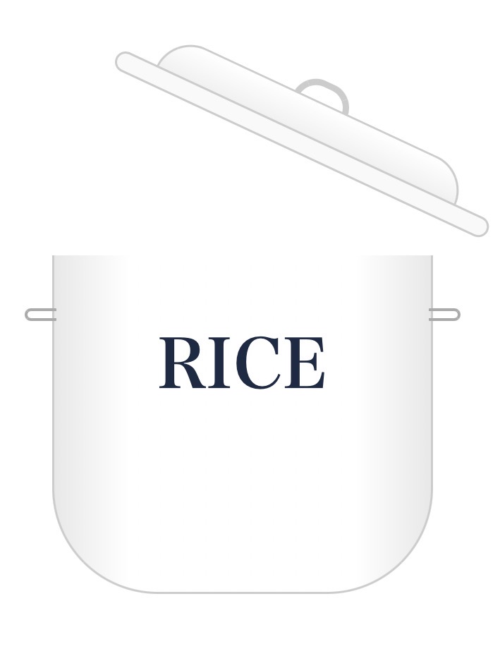
マウスを乗せるとこのように動きます!
【アニメ付】パカッと開くRICE缶
<!-- 蓋が開くアニメーション付きRICE缶 -->
<div class="can-rice-anime">
  <div class="lid-group">
    <div class="r-h-top"></div>
    <div class="r-lid-top"></div>
    <div class="r-lid-brim"></div>
  </div>
  <div class="r-body">
    <div class="r-side h-left"></div>
    <div class="r-side h-right"></div>
    <p class="r-txt">RICE</p>
  </div>
</div>

<style>
.can-rice-anime { width: 180px; margin: 20px auto; position: relative; font-family: serif; text-align: center; cursor: pointer; }

/* 蓋のアニメーション設定 */
.lid-group {
  transition: transform 0.4s ease-in-out;
  transform-origin: right bottom; /* 右下を軸に回転 */
  position: relative;
  z-index: 10;
}
/* ホバー時に写真のような角度で開く */
.can-rice-anime:hover .lid-group {
  transform: rotate(25deg) translateY(-25px) translateX(15px);
}

.r-h-top { width: 28px; height: 12px; border: 3px solid #ccc; border-bottom: none; border-radius: 12px 12px 0 0; margin: 0 auto -2px; }
.r-lid-top { width: 156px; height: 18px; background: linear-gradient(#fff, #f0f0f0); border: 1px solid #ccc; border-bottom: none; border-radius: 40px 40px 0 0; margin: 0 auto; z-index: 2; position: relative; }
.r-lid-brim { width: 194px; height: 10px; background: #f9f9f9; border: 1px solid #ccc; border-radius: 8px; margin-left: -7px; margin-top: -1px; z-index: 3; position: relative; }
.r-body { width: 180px; height: 160px; background: linear-gradient(to right, #e8e8e8, #fff 20%, #fff 80%, #e8e8e8); border: 1px solid #ccc; border-top: none; border-radius: 0 0 50px 50px; margin-top: -4px; display: flex; align-items: center; justify-content: center; position: relative; }
.r-side { width: 15px; height: 6px; border: 1.5px solid #aaa; position: absolute; top: 25px; }
.h-left { left: -14px; border-right: none; border-radius: 4px 0 0 4px; }
.h-right { right: -14px; border-left: none; border-radius: 0 4px 4px 0; }
.r-txt { font-size: 32px; font-weight: bold; color: #1a2a44; margin: 0; letter-spacing: 2px; }
</style>
自分好みにアレンジする方法
1文字を変える
コード内の「LAUNDRY」や「RICE」を「BREAD」「TOYS」などに書き換えるだけ!
2色を変える
background: #ffffff; の部分を #fdf5e6(アイボリー)や #add8e6(水色)に変えるとアンティーク感がアップします。
3文字の色
color: #1a2a44; を書き換えるとロゴの色が変わります。黒やグレーも落ち着いていて素敵ですよ。
コメント